
53rd Earthworks Clay Annual
Selections & Juror’s Comments
Juror: Suzanne Hill
Successful Entries
Thank you to all the artists who submitted work We received 170 entries. 65 were selected by the juror by Suzanne Hill. Here are the successful selections:
1, 3, 4, 5, 6, 7, 10, 11, 12, 13, 14, 16, 17, 18, 19, 22, 24, 33, 35, 41, 42, 43, 44, 50, 52, 53, 54, 55, 56, 57, 58, 60, 62, 63, 64, 65, 70, 72, 76, 78, 81, 83, 89, 90, 92, 107, 109, 114, 115, 116, 119, 124, 127, 132, 133, 134, 137, 138, 142, 145, 149, 153, 162, 164, 166.
Award winners will be announced at the opening reception Thursday April 23 at 7pm
Congratulations to the award winners
-
First Place
Laura Rotelli
"Edward"Second Place
Kit Grindeland
"Cloud Form 5"Third Place
Mary Ann Thorne
"Cephalobowl" -
Dea Haupt
"Lord of the Gears"Jean Cotton
"Pick Your Poison"Terry Van Heusen
"Ballerina"
-
I’d like to share a few thoughts about the jurying process. Each juror brings their own artistic perspective and inherent biases—this is simply part of participating in a juried exhibition. Having been on both sides of the process, I encourage artists not to take decisions personally. A piece that may not resonate with one juror could be highly valued by another in a different context.
It’s also important to recognize that every exhibition develops its own character. In selecting work, I consider not only the strength of individual pieces, but also how they come together to form a cohesive and engaging show.
The juror provided commentary on over 100 of the submitted works, including pieces by artists who were present at the live jury event. However, due to time constraints, the juror was not able to comment on every entry.
Comments are listed in chronological order, according to the submission number assigned to each entry.
1. I'm choosing this one here, more on the quirky side, like the use of color. I like the little squiggle here on the bottom; it's almost like this could be in a restaurant, right? I think this is really well done.
3. Honorable Mention, Terry Van Heusen , "Ballerina" This is a really well-sculpted piece. Is the artist here? Nice job! I love the color. I love how you continued the shape and the color here on the tutu all the way down into the piece itself, the pedestal part of it. It's a very quiet little piece but it just works very well. I mean just in terms of the proportion, it's very hard to get proportions right when you're working with figure sculpture and I think this really works well in terms of its proportion. I think also I like the combination of shiny and matte here; I think that works really nicely too.
4. We have Beach Day. Again really well done use of sculpting the form. I don't even think this backdrop is necessary. I would have liked to have seen it without the backdrop; I think that would have been enough. I still felt that it needed to be included because it was just really well done. Love the tattoo on her and the colors. For me it kind of evokes almost a 1950s bathing beauty kind of thing, where you've got that stripe, where you've got the boy shorts and the whole bit. Well done with the eyes. I think that's important when you're looking at some of these figure sculptures, even the quirky ones, even the horse. If you pay attention to the eyes it makes all the difference and this one has that and your other sculpture also has that as well. And I think this was done really well.
5. Fish! The title is Group Swim and so it is but I think this is again a lovely use of color here and interesting in terms of when you have something like this and it's kind of an amorphous shape. You want to make it work and there's a lot of movement in here and everything kind of works together. You've got this background which is kind of earth-toned and then all these different fish colors. It looks like a coral reef to me. It kind of gives you a little bit of shading in the background. You see how it's darker around the edges? Yeah and that really works. I think what they did was they did an iron oxide wash over everything, kind of sponged it off a little bit, and then did the color. Oh okay cool, because it would be hard to do that iron oxide wash and shade it there without doing the color first.
6. I think this one's going in. It's great. It's very pretty. I bet it sells. Yeah okay this is going in.
7. Wow! Title is Winter Waves. Wood Firing. I love wood firing. I've done a lot of it since I was at Notre Dame and I really feel that this piece incorporated a sense of wood firing but also used glaze in a way that works with the unglazed pieces. I like the shape itself is very interesting. I wouldn't have said waves; somehow to me this looks more like a plant or something. Seaweed? Seaweed, yeah. Oh I say yes. It's hard to pull off this kind of shape and make it work well and I think this has been done very well in terms of the shape itself without making it too fussy. It's really evoked a lot of movement so yeah I think it's a successful thing.
8. Yes I almost included that too but I had some issues with the shape. You see how the line needs to come down; it's a little wide right here, in this area. I know that with coil building you always want to be looking at that silhouette. I don't know how long you've been doing it but–not very long so you've got a ways to go. Large scale, well I appreciate the effort on this and I love the figures but I just felt like I couldn't include it because of the shape. I think if you're looking at this shape here, it needed to go out a little bit more or it should be angled a different way so that it came in a little more. I like the fact that you put the pedestal on the bottom. When you're looking up here I want a little more delicacy to the handles and to this rim here because you have such delicate figures. If you're going in this direction really make a study of these amphorae but look at the shapes. I would encourage you to keep going with this. I would also encourage you to try Terra Sigillata because the Greek vases were originally done in Terra Sigillata. The sheen on a Greek vase is actually not glazed; it's a clay sheen and it looks very different when you're looking at it. Also it's less orange; it's more of a red-brown terra cotta look so if you're really going to lean into that, think about Terra Sigillata and you can get it in different colors.
9. I didn't choose this and, again, being the nitpicky person that I am, there are a couple of different reasons: The top overpowers the base a little bit too much. To have this much top, I would have liked to have seen a little more base, maybe a little higher. I want a tension between seeing the throw lines here. I would have gotten rid of those throw lines because everything here is smooth, right? You want that to continue down into the throw lines as a way of kind of continuing that same ethos, that your pieces are cracked a little bit in the firing. That's something that comes with a little more maybe attention to when you're putting it together. It was a little too dry down there. One of the things that you have to be careful of when you're forming is, of course, I don't know what it was like while it was being done, but this here is drying at a different rate. It's kind of like a handle. One thing you can do when you're putting it on like this is put a little wax over it and that will help that drying process kind of equalize so that you don't have the cracking. I think also it would have been interesting if you had done something with the inside to kind of play off the outside, like maybe done a dark glaze on the inside so that when you're looking through these little holes here you see that. I think that would have just made it pop just a little bit more. Like a Tomoku, because I mean it's wood fine. Yeah like a Tomoku or even a Shino. A Shino would have been interesting because then you get the kind of iridescent thing going, like maybe a dark Shino that could have worked. Really practice your throwing. I know you're throwing big and that's great. It's kind of heavy. It's meant for outside, which is good but you can still practice using metal grip on the outside and you'll get less throw marks.
10. We have Stone Seedling Base, Pit fired. This one spoke to me in a couple of ways. It's kind of evocative of Jomon pottery, if you know what that is (really old, old Japanese pottery), and it also kind of reminds me of some Paul Briggs's work. Are any of you familiar with them? Paul does pinch pots but he does these enormous pinch pots and he pinches the sides out so you have all this kind of almost side pieces here that all come from the same thing. I like the uneven quality of it and I think the pit firing really works with the shape. I don't think this goes with it, right? No this thing is just holding this stick. Yeah that was distracting to me; I was like, "What is this thing here?" but then Jason told me to go to the piece. Yes I think this is a really nicely done piece, real thoughtful in terms of the form. This kind of shape is hard to pull off but they did a good job.
11. This is a little bit of a quieter one and this one is more almost mountainous. You can do this way too. Nicely done for what it is and a really good use of glaze. And I like the way this evokes pictures without being pictures, being more of a sculpture. I think that when we are working in clay we come from the functional, even if we're doing sculptural work. We come from vessels. This one evokes vessels but is a sculpture so I like that combination. Also really interesting glazing work here. Color-wise you have this roughness which plays well against the shininess up here. This looks to me like a barium glaze. I don't know if you use barium glazes here but it has that brightness. I'm really curious about the artist here. Now, as many potters are, I am a materials nerd and I love knowing what's in glazes. I would love to know what they used for this because this brightness looks like barium with copper in it but it's a really nice use of slips, glazes, texture, and color. The combination works.
12. Number twelve is titled "Madras Bull." Okay so this person probably saw India in there, Madras, right? Madras is from India. So sacred cows here are Rama bulls and then this. I lived in Bangladesh for five years so to me this evokes a kind of South Asian color palette. A little bit less bold but still there are reds in there, there are blues. When you live in South Asia, the way we dress here is so drab compared to what they dress like there. Bright colors, bright blues, reds, fuchsias, yellows, and to me this is somewhat of that too. When I first looked at it from my own perspective, I saw a Georgia O'Keeffe skull here and I saw Southwest United States kind of topography here. This is an example of you put into it what is your experience so I do like the way the kind of flat long areas and then the skull or the shape of the head itself kind of comes out of that too. Can we see the front? Do you see Georgia O'Keeffe in there? I do.
13. Second Place, Kit Grindeland, "Cloud Form 5" Cloud form. It's Pit fire. Is the artist here? Love this piece. Again this kind of unusual form is difficult to pull off. I think the firing really works without overpowering it. To me it just kind of looks like part of a coral reef or something. It's a cloud form but it's a very unusual cloud in this case. I do like the way all the negative and the positive space work together. You can look at this. I'll turn this around very carefully and you can see on the other side it's just as interesting. Now this is going to have to be in the middle so you can turn all the way around. Did you put Terra Sigilata on it? A little bit, yes. Much of the shine is from ferric chloride, I guess. Did you put ferric chloride over the whole piece or just? I spritzed it so all the orange and then some of the glimmer are where the ferric chloride got some nice hot spots. What I love about these kinds of pit-fired pieces is that there's so much that's left to the element. You have to know a certain amount; you just don't throw stuff in; you have to kind of figure it out and then let the process take over. If you don't know what's happening you can't get these kinds of effects and I think people don't understand that there's a lot of thought that goes into this too and pit fire. Oh my gosh I can't believe this came out. I stopped pit firing a while back and did sagger because the rate of breakage in pit fire is sometimes 50%. You should start doing sagger firings and you can do big.
14. I'm going to move this because it's all kind of obscuring that guy's face. The title is "Little God of Many Eyes,” wood Fire. You know it's funny because when I was looking at it one of the things I was going to say about it was that it kind of reminds me of some of the Middle Eastern gods/goddesses. It has that sense to it. It's very well-sculpted. I like the texture that's here. For me it's almost a little bit on the creepy side but it works in a very visceral way, I think. Really interesting the way they used color here too because you just have a little hint of blue in some of the areas and then there was wood fire, right? That's what it says. When you fire in wood you're almost letting the gods take over too so I think what this person did was they had enough knowledge of wood firing to know where they should add color and what color should be added and where to just let it be the color of the clay. You can see that here; this is the color of the clay. This is a little bit of glaze, not too much, in the eyes and it all pulls it together in the end.
16, 17, 18. The boats now. I don't think we can fit more than two of them but you get the idea: one thing I look for when I'm looking at the quality of work is the quality of craftsmanship and these are very well crafted. I don't know if you can see this but also there's, as a ceramic artist, everybody always turns the piece around to see what they've done on the bottom. That's a very important part of the play work; you want to see every little part of it and make sure that the intention to detail is there. I love this for just regional quality because here we are on the ocean and these pieces look like they've been nicely weathered. I love the way the artist has used color in this and not made it shiny. I think these are a really nice reflection of another way to work and this is a very different way to work with clay as opposed to the other one.
19. Dama Deco, Earthenware, Majolica. Ah! So this one, are all of you familiar with Majolica, the process? The painting is done on top of the glaze. You lay down a white glaze first and then you paint over it. This shows a lot of mastery in terms of painting and illustration in general, which I like about it. I also think it very much evokes a kind of, how can I put it? Art modern, you know that particular type of style, but just very masterfully done, very nice job of taking care of the shape. This is a heart shape, to work with that circular shape. When you are doing an illustration she or he has done a really good job of taking advantage of that round shape again.
22. I love the use of glaze with the texture here. This looks like a bronze glaze to me and the way you get the thicker areas very dark and the thinner areas have this grain here, almost like a bronze. It works very nicely.
24. This one I chose. I like the quality. I know crackling is random but it really worked in this case along the side here and it's a real good solid use of the black and white in Raku.
30. This guy almost included it. I felt like the arms weren't well formed as they could have been and that's something you can work on. The body is fine but really pay attention to the arms. It's a question of paying attention to detail here. I would encourage you to keep going in this style and really work on, even look at videos about figure forming figures because I think you could take that extra step and go a little bit further. The other thing is the butterfly. I almost felt like it was too much that she would be fine without the butterfly and just by her so I would just encourage working with the arms and then maybe thinking about maybe nothing in our hands, maybe something very simple but it's a good direction.
31. Okay so tell me about this piece. It looks like raku. It's a luster; they crackle. I didn't choose this one because I felt like there was almost too much going on. I think if you had not put this blue glaze on, it would have been more successful but all this drippiness here kind of takes away from all this other stuff that's going on. Sometimes it's hard to tell because glazes will do things that you're not sure they're going to do. I think what I would have done is I like what's going on here with the blue because it's almost painterly but here it starts to overpower. The same thing is true with the sides, all the dripping again here, gorgeous, really nice here, a little bit too much. I think that's something that you can work on. Maybe what you do in this case is a white that crackles but that would have been a really nice kind of thing to set off this part here. So think about here, the white and a crackle glaze and no dripping. I think that would have worked really well.
33, 35, 55. I want these three together because this is to go together:. I like these three as a grouping. They kind of relate to each other in a very geometrical and yet rustic way. Really nice use of glaze here. You see how the glaze kind of moves off the edges so that you have, you take that as a decorative effect too. I like the way this person has cut geometric shapes into the piece itself. It's well crafted, no cracks. That's important and I think whoever used this glaze knew that they were doing in terms of there's a glaze on top here, which gives you this look like a tobi-moku. You see how it's almost iridescent; it looks like it could have been a combination, might be on that one. I would have said Shino but you don't put Shino on top of things. At any rate it's a very nice combination of glazes and this is a nice quiet piece, a little bit gentler but it echoes these two. It's a nice combination and a nice use of geometrics.
41, Honorable mention, Jean Cotton, "Pick Your Poison" 43. Okay now we're going for quirky. 43 is titled "Nerd Bird". 41, the title is "Pick Your Poison”, Stoneware and porcelain". These are both very quirky. I love them. This one, to me, evokes those face jars. It has that feeling on steroids. In both of these the eyes just really stand out and that's what makes the pieces. I think the use of color really works too. This guy, I mean, you don't want to meet him in a dark alley. A little tiny cork in this one too? Yes so it's a face jug holding a face jug basically; only he's got what he's got, little skull, so you don't want to drink that.
42. Oh lovely! 42 is titled Bird Song. OK another bias: I love birds. I have a bird. I have a parrot. What kind? Blue-crowned conure and he's 22 years old so he knows us better than our kids. He's been longer there. This, I think, is a nice sort of almost innocent way of looking at this. The bird is not like something you would find in nature but it's a wonderful evocation of what a bird might be with the flowers without being Disney. I do like the texture along the rim too and how the glaze pulls in the texture so it gives you a quieter little background but still relating to the inside and a nice use of color.
44. We have mask-off slip cast assembly so this is all slip cast, huh? You can tell it almost looks like the dolls so this has got this creepy kind of scary doll quality. That's what drew me to it in the beginning and I'm sure they were going for that because otherwise they wouldn't have had this little head in here. Again nice use of glaze. Not sure I like the drip here but I like the way the texture is coming out here and just the fact that it leans like this. It's sort of off balance; it's a little bit off balance in a lot of different ways. Turn it sideways; yeah, looks like it's about to fall. I think that kind of creates the off balance part, which is tension, exactly.
50. Now we're going for quirky. The title is "Paruntatunt." You're getting tested today. You know this is everyone that goes on AI and asks for their titles. Who knows what that means but I like the piece for its quirkiness. To me it kind of evokes a carousel in a way. This little thing up here looks like some kind of one-eyed monster but what I like about it is that it can be anything. Looking at it sometimes you look at a painting and you think, "Oh I see this, I see that." This is kind of like that. This is something that you can put your own spin on; you can look at it and say, "Oh yeah I think this is what it looks like." This is a little worm creature coming out of a carousel. It can be anything you want. In ceramic art right now there's a lot of sculptural quirkiness, almost cartoon pieces, and I think this fits that category very nicely. It's almost like something out of a dream. Yeah I think this is and it's done well. For the piece I like the use of color, a lot of really bright imaginative colors in here.
51, 77. I love the decoration on this but I felt like the foot is too large for the piece. When you look at it the foot kind of overtakes the piece in a way that it shouldn't. The foot should be more of something to enhance it. those were made for children to use? Okay so the way you deal with that, you want that wide foot. You can trim it a little bit and then trim this on an angle and you get the same idea. What your eye sees is something that's a little finer in here so that, instead of coming out, you come in and that changes the look without giving it any less stability. That's something to think about if you want that wideness and you're not going wide here.
The other thing I would say is you see how it's straight across here. It'd be nice if there was a little curve to it, rather than like a cylinder that wants to be rolled. Do a curve that way you could trim in and then trim in a little bit to make that angle and still have that stable base. Love the decoration though.
52. Storms Whisper, coil-built stoneware. This one's a little heavy and I almost didn't include it but I love the glaze. I love the way the glaze works on this. I think it was a real masterful use of glaze. There's a whole lot of pin-holing but somehow that works and it doesn't really. Maybe it's not even pinhole and maybe it just fused later because it doesn't feel like a pinhole piece. Is the artist here? How did you glaze it? I think the layering really works on this and I like the matte quality of it. I would encourage you to try a little bit thinner coils. I do like the edge; the fact that it's not even. I think if you work with thinner coils it could be a little bit more successful. I'm also going to challenge you to work big, even bigger, because you can do that with coil as long as you make sure you baby it along and don't dry it too fast; then the sky is the limit, your kiln is the limit.
53, 54. Glazed red earthenware? Earthenware, interesting. There's something about this piece here that really intrigues me and that's the way the person did the lichen. Is the artist here? No. I would love to know what they did here although lichen is not this hard but it really is kind of interesting and it really pulls the piece together, the pieces of wood in quotes. I think the glaze worked really well for the leaves; it does evoke a very dark, kind of woodsy feel to it. I would love to know, construction-wise, how they put this together. It does evoke that. What was the name of the French palissy? Has anybody familiar with that? It's the kind of 18th-century French and German ceramics that used a lot of leaves and fruit and they do soup tureens and cover jars and it was all covered with all sorts of natural forms. It kind of evokes that without actually being it; it is more of a sculptural piece. I'm just going to briefly bring this one up so you can see because it kind of is really a companion piece to the other one. You want to open it up but it's not open. Again a very kind of real masterful use of glaze here too. This one is a closed form; it's not going anywhere. I like the way the person alternated light versus dark and did you see here there's a little snail?
56, 63. 56 is untitled, wood fired clay. 63 is also untitled, wood fired. I thought these went together very nicely. It's sometimes hard to do this kind of thing. It's really simple form and just add a little bit of texture and I think this one shows a lot of restraint. They didn't go completely overboard with the texture, just enough to give it a little bit of interest and I love what's going on here. I think that's probably mostly ash but could be some glaze involved there too. Also I love the combination of what's going on here and it looks to me like what they did is glaze some of these two panels here. You see how shiny they are, probably shino, and then look at the other parts on the lace and that requires a little bit of thought. You don't just throw it into the kiln. I think what happens in the wood kiln sometimes is people think, "Okay I'm just gonna let the wood do its thing," but it's also very important to think about what's going to happen when you take it out. Do you want some interplay between where there is glaze and where there is not glaze and I think that's what makes this one so successful.
57. That's a great one. The title is "Untitled,” woodfired. Did they say what the forming method is? Does not. Anybody do this? I think it's thrown. I like the shape. I like the movement on the top. I like the fact that they placed only the inside and not the outside, be what it was. Although it looks like it has a little bit of an oxide wash on it too. This is one of the quiet ones that I thought needed to be included. There's a little bit of movement here so the person who did it really needs to think about the base because sometimes I notice that this is completely flat. Sometimes that helps, just to give it a slight curve even if you don't want to do a foot. You just curve in a little bit here and then it doesn't get rocky but for the most part it's very nice.
58. I'm not sure if they go this way or this way but I guess it doesn't really matter. What I like about this one is it's very simple in shape, very simple use of glaze but I love the way they have taken advantage (I'm assuming) of pouring the overlap and no glaze at all. I think that, if you do it this way, it's almost like a landscape. The title is Scenic Overlook. Oh there you go.
59, 61. I didn't include these because, shape-wise, it's a little heavy. I just encourage you to keep working on your throwing and this shape is, I think, perfectly fine. This one, there should be a little more definition between this top part and this. I sort of think the top is maybe a little bit large for this. I would have made this a little bit bigger, okay but glazing is great. Well I detect a theme and I really like the glazing on this but you need to work on your throwing because it's really heavy. This one, kind of a nice shape, but I think the glazing wasn't as successful. Part of it is the glaze is a little too thin on the top. You want, when you have something with texture like this, a lot of times when the glaze is really thin it ends up just looking like glaze that's too thin. What I would have done with this is maybe put a little extra glaze because down here it is starting to be really nice. If you're worried about glaze running, what you might want to think about is that when you're doing wood firing you use wadding, right? You can use wadding on something like this just in case it runs too much and then just grind the bottom so it doesn't kill the kiln shelf.
60. Little tiny one. The title is Joy. Little tiny piece but I liked having it. I don't like to overlook the small pieces because there are some small, little, quiet pieces that really can speak to you. To me the use of glaze in this is really interesting. This is another person I’d love to have a conversation with. What did you use on this one? In a way you've got it; it almost looks crazy here and yet it might not be. The shape is a little bit rustic, almost thrown but it almost looks pinched on the top. The use of the glaze, I think, there's a glaze over a glaze here but it almost looks like it's crazed and multi-fired. It's kind of hard to know. Is anybody the artist? Okay tell me. Okay well actually it was a glaze on top of a glaze and it was just one of those wonderful mistakes that was sort of like a happy accident. Yes. Yeah I love the way that the copper glaze on the top went into the crazing.
62. And we're going from rustic to colorful. I love the use of color here and I love the use of form. You can see that it is a very playful piece. One of the things I used to do, I taught a teapot part of one of my classes and at the end everybody had to put water in their teapots and pour them into pitchers. I love the shape of this. If it was functional too it would be even better but it probably is functional. There's a little bit of a hole. I would have liked to have seen quite a little bit larger hole there but what stood out for me here is just the use of color, really nice use of color
64. I'm gonna go ahead and choose this one. Is the artist here? No she's not. This is the classic green man type thing, the modeling of the face is really nice. The attention to detail along the sides is well done. The coloration is good and so it all works and I like things like this little green eyebrows. I think that works well too.
65. I love the movement in this, both this edge here and this. This was one of these things where when you're wood firing you just hope for something like this because the way the ash hit it, the flashing just works with the piece. Even the inside and the outside here kind of work together as well and you almost have to look at this from all sides to really appreciate it. I like the way this person looks like it's porcelain. It's high-fire stone ware fire in a wood soda kiln but this is porcelain, this is not stoneware. Look at the white hair but it really works well with the glaze inside. I mean there's a lot of attention to that glaze and then they just let it rip on the outside, which is great. This is an example of letting the process take over, setting up your conditions and letting the process take over, which I really relate to.
69. This one, it's well done but to me it's almost a little too cute. I think it's hard when you're doing animal sculpture. You want to be careful of crossing that line so I think it's interesting. Also I would want to see, again being nitpicky, the little creatures come away from the background a little bit more. Maybe a little bit lighter, you know? You can take artistic license for this thing; you don't have to have it exactly the way the animals are. I would have liked to have seen them pop out a little bit more than the background here.
70. Honorable mention ,Dea Haupt, "Lord of the Gears" Alright now we're going for quirky again. This is Lord of the Gears. Can I relate it to this because of steampunk? This is very steampunk and it works and I love the little hat here. This is interesting because what they've done is a combination of color here, sort of a matte color here and then a shiny glaze. That can be very difficult to pull off too. You know here you would think, "Oh well, this is a question of whether that glaze will smother the pieces," but it really hasn't. I think actually if you look at the ins at the back of it, you see all these gears and the belt, the buckle. What they've done is they've worked with glaze in a way that works with the piece and does not overpower the piece. That is a good use of glaze here. Now is the artist here? No, okay. Very interesting.
72. Yes this one I love for the imaginative quality, not only for the shape but also for the glaze. This looks to me like it's a crater glaze, which is a very unusual glaze to work with and tricky. I love the way it evokes coral without actually being a coral shape. It has a quality, kind of a rustic quality, that works with the shape so this is a nicely done piece, also not too heavy. What's the name of it? Rumination number two.
74. This large one, really interesting glaze here, but I really feel that the shape itself, I mean, it's a very ambitious piece and it's a hard one to pull off. I really think that I would have liked to have seen a little bit more coherence in the shape. The glazing, I love the glazing, is really interesting but I just think that when you're building something like this you really have to pay attention to where your shape is going. I just feel that that shape just didn't quite come together.
75. This one here, I think, if you're building something out of coils, you don't need to build it quite that heavy. This is probably more of an individual bias but I'm not sure the whole love thing works that well and I would love to know the reason for some of this. I see the heart shape on the top. It's hard for me to talk about this because I just feel like I'm not sure where the person wanted to go with this. Let me see this bottom. If I were to make this piece and really kind of try to improve on it, I would have done a couple of things: Maybe make it larger. Maybe make the coils a little thinner. I'm not sure I would have done heart the way it was done up at the top.
I might have cut it and pinched it just simply because to me the heart almost looks like an afterthought and maybe you want to put a little more thought into how you end the piece.
76. Here's another tiny little piece. Looks to be raku fired, but I like it for its kind of childlike quality and the glaze works with it. The title is Otto. It's raku. We decided it was a gerbil, right? Just a nice sort of almost gestural way of forming that works with the piece. You know what it is without being really, really realistic, just a nice another little quiet piece.
78. I really love the delicacy of it. The title is Future Relic and it reminds me almost of something you see on the beach. I really like the use of whatever this is. I think it's clay but it's just so delicate and it almost looks like a piece of jewelry too. I love the use of color. The color is very subtle but it's just enough to kind of draw you in. It's really hard to do this kind of work and to make it work as a hanging piece. I've done these before in Sager and you have to have something here and you have to have something on the bottom. You want to have something that doesn't overpower all these little pieces but works to hang straight down. Just technically it's all well put together as well.
81. I might actually include this one. But I like this one and there's really no reason why I shouldn't include it. I like the way the coloring is done, a lot of the attention to detail with all these little lines. The fact that it really fits well and the shape it's set for is almost an egg shape, isn't it? Yeah I like this. It's going in.
82. See this? How it rocks? Yeah one reason I didn’t include it. Also I felt like I didn't like this part right here: no glaze. I felt like there's so much going on glaze-wise here and then no glaze. It just didn't make sense to me. I would have liked to see the entire thing glazed. I think it was a really interesting glaze job but I don't think the part that wasn't glazed worked. That really was the main reason why I didn't do it because I love this glazed combination here but this I don't understand why they didn't glaze it. It would be interesting to know that.
83. This one I chose because I like the way the glaze works on the inside. Is the artist here? No but it is a real nice kind of cooling effect. There's a little bit of texture on the outside and then there's all this stuff going on that you don't see. That's what's fun about ceramics: there's prizes. The more I've gone to NSECA, the more I'm always trying things over because that's what we do. People are paying more attention to the bottoms than they used to, including doing little drawings on the bases or things that you can't see unless you pick them up. There's a lot of attention to detail both on the base and on the piece itself.
85. I really like the decoration. I felt that the form itself needs a lot of work. I would like to see more of a belly here. I'd like to see it come in a little bit more here and I'd like to see the rim. What you see here is a kind of a lack of definition between the rim and the rest of it. Even if it's just a line, it may be flared out a little bit or just something to differentiate it from the rest of the piece. Also if this bellied out a little bit, this shape here, the size of the base would make more sense.
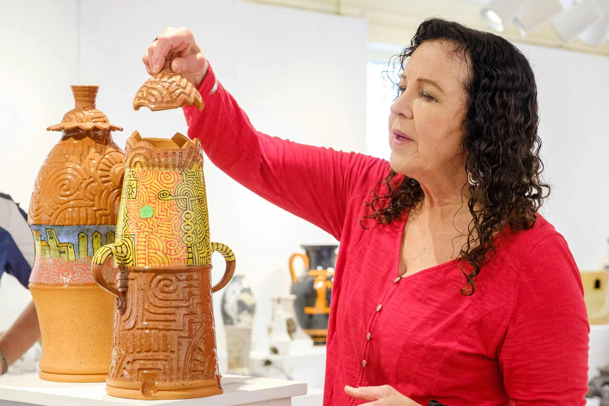
89, 90. Eighty-nine is titled Irie Jar, terracotta and what was the other one? Tuscan jar, also terracotta.. It just makes sense. To me this one kind of evokes a pre-Columbian design, almost like an Aztec design. And this one is a little quirkier because you've got this little scene going along here but also looks kind of Mexican too. So I think because you've got here this carving is also very pre-Columbian. I love the unusual shape. I think it's one of these things where this can work or doesn't work but this one does. These both do and they work together as a combination very nicely. I like the way the handles are done here. The use of color and terracotta works very nicely too. I want to know: Is the artist here? No, I don't think so. I think they must have lived in Mexico, or at least been to Mexico. It really says Mexico to me. A nice use of throwing and altering, too, here. And hidden lid. I don't know if you saw that. Oh, I saw that. So what's cool about this and you can do this with any kind of box that you do is and this keeps it moving so you have it go along the design but it also creates kind of its own little flange in a way so you don't have to make a flange or anything like that and this is again very nicely done because sometimes when you do this when you cut it, it will move and then you'll have something that doesn't quite fit. So this was done when it was wet enough but not too wet so that that didn't have one.
91. Really heavy and I think this person has an interesting sense of form. It's kind of like a pine cone or it almost looks like those colonial pineapples too so it's an interesting idea. The top is really heavy and could have done with a little trimming maybe and the base is also kind of unresolved. It's a question of this person needs to do a lot more practicing and then it might work a little bit better. The shape of it is just a little unresolved and see how it goes flat here and then it curves. It would be nicer if it was just a curve and the same thing down here. A lot of that has to do with trimming but also the throwing in this. You can tell that this person has a little bit of practicing to do.
92. The fish. This again is a very imaginative use of clay and of color. I love how there's a very light, light coat of clear glaze over it, not enough to smother the color. What happens a lot of times when people are using color is if you use too much glaze it ends up looking like a polyurethane coating on it. This is just enough to bring the color out without really affecting it too much and it gives the effect of a fish just out of water, where the scales are really bright. I love that about it and it's also very well-pressed.
97. I felt like the glaze kind of overpowered it a little bit. I would have liked to have seen it either satin or matte. Sometimes people don't understand how a glaze can do that. I think that sometimes it depends on how much you know, how much experience they have, but I think the modeling is fine. I just didn't like the way the glaze was on this one.
102. I almost felt like there was too much going on. I would have liked to have seen something where I could kind of rest my eye either on the vase or this. I felt like one of these aspects had to be more predominant. Maybe the vase should be a little bigger. Maybe there should be another vase somewhere. I think it's an interesting idea but this is hard to pull off. I appreciate the effort that was put into it too.
106. It's like this really ornate frame and then the piece kind of gets lost in there. If it was a different frame, I probably would have included it.
107. And what's the title of this? Sake set for four. Plus two. This I chose partially because the glazing is really beautiful and very thoughtful. I like the fact that it's got a matte surface on the outside and really shows through the color very nicely. This, I assume, is kind of like a spout where you can pour from but I love the way the spout was incorporated into the design of the piece. You have multiple spouts but you also have something that's very functional while looking almost sculptural. These little pieces echo the top of the larger piece very nicely and there is good use of glaze.
109. A green peace. Oh yes, very good. Is the artist here? Is it slab built? Yes. Nice job with the slabs and a nice job with these cuts here. I know that's difficult to do without cracking so you must have done a few of them. I would have loved to see this a little bit deeper, the flange. That's just a functional thing but the glaze works really well with the piece. I think part of the thing when you're glazing is a certain amount of restraint and you let the texture and the shape shine and the glaze kind of just enhances that. It is a very nice classical shape too. You have enough of a small base and a larger belly that it really works together. The top, I know sometimes the tops are really hard to figure out so what you've done here is, if you look at it, you look at the form as an entirety. This, even though it comes in, it becomes its own shape like this. I think that's very important when you're doing covered pieces; they need to speak to each other.
110. This guy, double walled, very interesting. And the cut outs, well done. You had that one piece that was in the right green peace. One of the reasons why I like the green peace was the form and this one doesn't come up to that in terms of the form so I decided not to include it. I would love to see this taller. I think that would be really interesting. Of course harder to do but think about it anyway.
111. I have to say I almost included these because I thought they were kind of interesting but I was wondering whether they should be shown stacked because this curve here you don't really see unless you have them separate. I think what I like is these two the best. Not sure about this. Not a big fan of the drip school and I think you did it really nicely here but this is a little bit more like, you know, you see too much of this and I like the glazing on these better too. Anyway they almost got in. I thought of doing the two of them but I thought the stack was more interesting as three rather than two. I think it looks better actually not stacked because again you see this curve here and you don't really see that if it's all stacked together. I like these two better than this one. Did you have a question? Well they stack nicely so from a functional point of view they fit in your cupboard better. I have done dinnerware sets; I did one for a couple that was in Boston and they were very adamant about having it stackable so that they could fit it into their apartment. I've done those before and actually did one for my son the same way where it was kind of like the bowls were cylindrical and then came down like this and they stack really nicely too. The funny thing with this was I wasn't sure if this was trying to be a sculpture or if it was trying to be functional. I think these were better almost like as functional pieces as opposed to a sculpture. If you are going for a sculpture maybe you wanted to think about a different kind of decoration.
113. This is very cute. The only thing I would say about this is I felt like the handle, if you look at it, is a little off. This is something so when I'm doing a handle I always look here to see if it's straight, okay and it's really easy to kind of put that handle on and not do it. See here how it's from here to here, it's a little off. I'm being nitpicky here but that's what I'm here for. Love the decoration. I mean the kids will love this or Alice will love this and I actually like this base because I think it really kind of goes with the quality of the cup and almost the waviness down there but my problem was with the handle here.
114, 115. This is where I get to show off how I can lift things. I'm assuming they are done by the same artist. They are Arch Dolman 1 of 25 and Arch Dolman 2 of 25. Wow, pit fire? Clay, paint, and sawdust fire. Sawdust fire, okay, which is pretty similar. Again probably my Saggar bias on this but I also like the shapes and I like the texture that the person has done in here. I think it really works with the shape. It's almost like, have you ever seen the sculpture of John F. Kennedy that was done, say in the 60s, and the sculptor? It was very rough and you had the quality of the clay right in that sculpture and you have a little bit of this going on in here. It's not overworked, which I think is good, and I think the firing really complements the shapes too without taking them over. As a ceramic artist you always have to think about many different things. You've got the forming, you've got glazing or firing methods, and both parts of that process are equally important. I have seen pieces that are just smothered when you put glaze on them so I think it's nice to have different types of firing available. Here you can do wood firing or you can do other forms of firing. I think what you want to do is take into consideration the quality of the clay and how that's going to relate to either your glazing or your firing methods.
116. I'm curious to know what they called it. Title is tidal pool. Ah okay. Nice use of glaze on the inside and what I like about this is the outside and the inside are very different but work together well. This also is a nice use of the throat. I'm assuming this is thrown and altered and I like the way the shell is kind of incorporated into the round shape. The carving is also nice without trying to take it over and they even trimmed it, which is very nice. Yeah I think it does evoke a tidal pool in the color and in the shape.
117, 118. I think the technique is nice on this one. I think throwing-wise smaller foot and a little more attention to detail when you're looking at the shape. Again this part here is maybe a little big for this part here. I really like the use of glaze. This is a wood fire piece and I really like the way the texture is pulled in here. For this one again it is a little heavy as a bowl. I think it's interesting what you've done with the carving. I think if you work on your bowls this again almost overpowers this part. You could do a larger bowl with this around it; it would be very nice. Also be careful of drips because they can be a little bit distracting. I like this part here where there are no drips.
119. Third Place, Mary Ann Thorne, "Cephalobowl" You need to see that. Very cool. This one is all about color and decoration and that's front and center. I have to say here's my unconscious bias: I love octopi and I think this is a really well-done piece. It takes advantage of the whole circular form and I love how the decoration is carried on to the other side. I don't know if the artist is here but bravo! The title of that was Cephalo Bowl. Cephalopod, I believe, is right. Rhode Island's calamari.
124. Very nice. The title is “intertwined in blue”. This is nice; blue and white is so much a part of ceramic history and I think that the decoration is lovely. I think the person who is the artist here: work on your throwing a little bit more and trimming. This needs to be kind of a little more convex or concave than here but your decoration is lovely. If you work on your throwing and maybe you work a little bit bigger or work on plates, you could just do some really nice things. I thought that the decoration was nice enough so that I included it.
125, 126. I almost chose this and the reason I didn't was because it's warped. Yeah a little bit. Yeah you did put so much work into it and it's beautiful. I'll tell you what happened here. You trimmed it too wet. I would suggest, instead of using a Hydro bat, what I would do is use a press board bat, not Masonite, but something that's got maybe about this much thickness. Then when you flip it you can take another bat and put it right on top and do this and that way you don't disturb it. The second part of that is the trimming. If it's fairly thin and you're trimming and it's a little bit wet, you'll push it down. I think that's what happened here. When you trim you need to have it a little on the dry side rather than as wet as you can trim bowls and things like that fairly wet but you can't trim something like this wet because it will disturb this part right here. This is fine here; the edges are fine but it was this that really made me think, okay? The painting is gorgeous, really nice. This guy is interesting but heavy. I would say kind of heavy. This plate, you need to work on your drawing with us. Okay but a nice idea and I like the color.
127. A little digression: I went to an arts festival in Park City, Utah, a couple of years back, and there was somebody there who was doing these kind of stone cairn-looking things all out of clay. They look like stone but they were clay and they were hollow. I would encourage the artist, if they see this, to think about doing your stones out of clay. They won't be quite as substantial but they might be a little more manageable. I do like the way the combination of almost little sparkles in the stone works against the glaze in this. I think the glaze works well because it's not shiny. I like the irregularities of this. It looks kind of maybe thrown on the inside but that kind of works with the piece too. I think this was a successful piece but I think they should think about sculpting their stones out of clay.
129. Okay I like this form here. This form is very African looking to me. The form, the glaze, very interesting. I feel like it just doesn't work with the pedestal part of it. I think the pedestal could have been simpler so that it would have shown off the form. Right now they're competing with each other and so maybe not quite as tall, maybe half that height, and a much simpler pedestal by itself. It's very interesting. It really is reminiscent of a lot of African work and I like that but just too much going on there.
130. This one, kind of interesting. I think that there's almost too many holes here. I would have liked to have seen maybe you, this bottom part, sell it and then most of the holes from this center up and it might have made a little more sense. I also would have liked to have seen glaze over the entire piece instead of some areas unglazed because the glaze itself makes it look almost like metal and I think that part is working but I don't like the part that's unglazed.
132, 134. 134 is titled "Cosmic Interplay", pit-fired. 132 is titled "Moonrise Blessing", also pit-fired. This is a nice use of pit-firing. Is the artist here? What happened here? This is where your terrasigilata craze a little bit because it's a little too thick. Sometimes that can work really nicely; sometimes it can be a disaster. You have to always be careful when you're putting on terrasigilata that you don't put too much on because it'll pop right off. I don't know if you've ever had that issue. It's one thing I'm going to talk about tomorrow when I do my demonstration. Love the colors that are coming out here. Can I ask you what you put in there? What in the pit? Copper sulfate, crystals, salt, seaweed wrapped around the pots, some cat food soaked in copper carbonate. Did you use any copper wire, copper wire wrapped around? Those are the lines of the copper wire. Oh and some sea lettuce. Sea lettuce? Oh go figure. The moonrise on the small one was sea lettuce. See those little orange and did you get that? Where did you get that? In the water. Is it local sea lettuce? Yes. Okay so in my work I use a lot of salt marsh hay and what's interesting with things that come out of the ocean is there's salt in them already. You'll get color coming from that salt into your piece without even having to worry about putting the copper carbonate or the kosher salt or whatever else you put in there. It's a way of getting little happy accidents too. I love the green in here. I'm assuming that's copper, right? Must be. Yeah, very nice use of texture and color here and I mean for all I'm being picky with the terra sigillata but for the most part you did a good job with the terra sigillata too. Did you put anything inside the piece? It's black, maybe sawdust. Okay yeah, it looks like it's very black. I don't usually put stuff in it except for sawdust. Okay good job and nice forms too.
133. This one here, again bronze but different glaze, I really love the texture on the inside and the irregularity of the rim and the way the glaze works with it. Is the artist here? I sort of felt like it was starting to become something that was interesting but wasn't quite resolved yet. I like the ideas that the person was trying to explore. I think that if the head was elongated a little bit more, some of these flat planes, these geometric planes, might work a little better because a lot of this is about geometry. It's in between trying to be a realistic head and almost a Picassoist head but it's not quite one and it's not quite the other. I felt like whoever's doing this should lean into it in one direction or another a little bit more and I think it'd be a little more successful.
136. The title was "I Got You". It's a box that opens. I mean it's interesting but I don't have a real good reason for not including it other than I kind of felt like it was trying to be one thing and maybe you might have wanted to lean into the sculptural part a little bit more and the box. As ceramic artists we want them to be useful too, right, so you've got the box and you've got the sculpture but I almost think the sculpture loses something by being part of a functional piece. You could lean into that sculpture, make it bigger, and try something a little bit different too.
137. The unfortunate thing is that a lot of times when you have a show you can't pick things up, right? Sometimes the underneath is one of the interesting parts of it. That's what I liked about this: it was a combination that almost looks like a shell, like an abalone shell or something. Being on this piece of wood makes it a little uneven but I do like what's going on between the wood. This is wood, right? Yes. The piece itself, because this is so rough, has a quality that's delicate in a way. I like this one too.
138. The title is Earth Bowl Series Number Two: Wood, Soda, High Fire. I love the multimedia again. To me this is very similar to the other one; I don't know if it was the same artist. Is the artist here? I believe she is. Oh okay, love the addition of the little skate eggs. They're skate eggs, right? It kind of almost relates more to the shape and I'm picking it up it's more interesting on the outside. If you look at that and you're looking in the show, you're going to have to do this because I do like that the incising on the outside and it takes some thought putting these together too. Usually those of us who work in clay, we're done; we don't want to think about it anymore after we're finished with a piece. This person has gone a little bit further with a little more consideration and put something together which really enhances the piece.
142. This is a well-modeled piece for a horse. The head, to me, looks a little bit different. Big for the body but aside from that I think the head is really the most expressive part of this because you really see the eyes and the movement very nicely. I like the use of glaze; that bronze green glaze really brings it out and in general it's just a well-crafted piece, a well put together piece. I like the way the eyes have been kind of taken and made prominent in a way and you do see a lot of movement in this horse. Somebody whoever did this has got to have been around horses a lot. I'm going to digress for just a second. I had a student a while back who was a state police woman in Massachusetts and she was in charge of the horses in the barracks at Concord. She died of cancer about 15 years ago and what we did was set up a fund for her, call it the scholarship fund, out of the high school. At one point I was making a lot of cups with horses on them. I got really familiar with horses and how hard it is to both draw a horse and sculpt one. They are not easy things to do so I have some appreciation of the process as well.
145. So this is a very nicely done functional piece. Notice this flange here. This is important to have it deep enough so that when you do this it doesn't fall. I did a lot of teapots at one point. One of the things that is very important when you're doing teapots is the spout. A lot of people don't cut off the spout; they leave it sort of a circle. What can happen then is a Coke bottle effect, where it kind of goes around the surface and doesn't pour well. This person has cut it off. You see how it's cut off straight and made into a little bit of an oval, which allows air to come here and when you pour it just comes out as a stream. I like that attention to detail. It's got a nice handle and very nice little quiet cups and the glazing job is very nice so good job on that one.
146. Yeah, this was an interesting one. I like the design. I didn't really like the way it was finished off at the top, mostly. I think this black and white painting could really, if they were to, she could work with this. Maybe she should think about doing some square plates, for instance. That might be a place to go. This is hard to pull off, and if she's a beginner, then I would encourage her to think about ways that she can deal with the finish of things and just look around, look at what other people have done. It also is a little rocky here, so that was another reason why I didn't quite think it was show-worthy at this point, but you know there's lots of ways you could finish this off. One would be to even take it, because this is kind of almost leaning in a little bit, you could have taken it in almost like a bottle at the top, you know where it kind of curves in, but I sort of felt like this is almost like an unfinished bit up here.
147, 148. Hideout one and hideout number two. I almost chose this one. I like the glazing on it. I just felt like it's almost a little bit too quiet for the size. I wanted to see something else: maybe another hole, maybe a couple of extra holes. I felt like this was almost like a stool or something and I wanted to see a little bit more but the glazing is gorgeous. It's a little heavy but throwing-wise when you're working on those tall pieces, that can often happen. The glazing is gorgeous, really gorgeous. This one is a little interesting because you've got the carving around this part here and you kind of highlight the job so I like that and I like that there's a little bit of texture here. I think if that glaze was here I probably would have chosen it. I just felt glaze-wise there's almost a little bit too much going on and I wanted to see more of this kind of textural quality here and a little bit less on the blue. Yeah I like this direction you're going in. This would be interesting larger too. Like you take this and make it double the size. I think it would have a lot of impact and use that way
149. You can see why I paired this with Mr. Steampunk because it has the same kind of quality. What's the title? The title is The Machine That Learned to Glow. I really like this shape. I'm not sure about this. Sometimes when you do a lamp the hardest thing to do is to pair it with the mechanics of the lamp. I think I would love to have seen more of an enclosed form here as opposed to straight up but I'm being nitpicky. I do like the use of a lamp. This is a soda fire, right? Wood fire. Okay yeah, I like the use of glaze, no glaze here and the difference in color. I don't know about this but again that's hard when you're pairing the parts of a lamp with the thing that you've done. I would have liked to see maybe just a little button here as opposed to this large lever though although it could work in there. I do like the shape. I tend to not pick regular old lamps because I think the shades themselves obscure the rest of it but this was unusual enough that I decided this should be on my shelf too.
153. That was Petrified Forest Echo, Stoneware. I thought this one, when a lot of people do wood vases, faux wood vases, and it ends up looking a little bit cheesy. This one they didn't actually use; you have texture mats, right? Everybody uses texture mats. This one is not a texture mat, which I like because it creates a kind of feeling of wood without actually shouting at you. The way they use the oxide wash makes it work very nicely. It's stoneware, right? Yes. I like the very thin shape; it looks like a piece of wood. Making it into a vessel is, of course, such a ceramic thing to do but it works in this case because you have this shape and then you have a little bit of something coming up here. It all works together, even then, with just this little bit here coming out and making this shape work down here. I'd like it thin and then a little bit wider up here and then just the top; it all works together.
156. I think one of the reasons that I didn't include it was because the shape was a little amorphous. If you're going to do it vertically you need to do really vertical or you want to curve it a little bit. I thought that this was interesting. The top is really thick and you could have taken a little more clay off of that or a little more clay off of here. This is a really interesting technique and I would encourage you to continue that too.
159, 160. This one I sort of felt like there was almost too much going on. I would have made more of an indent here with the foot. It's kind of heavy on the bottom; you could have taken a little more off right here in the curve and maybe given it a little bit more of a foot. Also when you're looking at blue and white, I know this is probably the character of this glaze. It's pulling iron and you have a clay that's really pulling iron but it's rather distracting when you have this and then you have all of this happening at the same time. I would consider using a different clay because I think this is a very iron-based clay. If you use a different clay, maybe a whiter clay, when you do this, when you carve through, you're going to get a nicer line here and here you won't get all the pulling iron. This is because this distracts from this. You want a nice smooth surface here.I would even think about maybe doing a dark blue glaze on the inside as opposed to a white but think about using different clay because what you're doing is you're doing a lot of work here and I think the clay is working against it. If you use a white clay again here pulling iron, same thing.
162. First Place, Laura Rotelli -” Edward” I love this piece. Is this terra sigillata? No it's under glaze, so porcelain. The clay is so smooth. Is it slip on top there? It's just porcelain; it's underglazed and then it's fired to vitrify but it's not glazed, it's waxed. I put wax on it so it's unglazed. I didn't want it too shiny. You must know scrimshaw. It's really lovely and it kind of spoke to me because of the 250th anniversary of the States but I love the very limited use of color here. I think that works really well. You must have done a little bit of a study of some of those, yeah but also the whale with those little eyes. I mean you've got pretty much everything just the way it should be. What kind of whale? A sperm whale. Title of the piece is Edward. Very nice. That's beautiful.
164. Cremation urn, stone ware. This is a quiet little piece and I think that any show needs a few quiet little pieces. I like the way this is just stoneware. It looks almost soda fire to me. That would be highly likely because there's some flashing that's happening here too and that could have been in the stoneware as well. It's well thrown and it could have been a little lighter but since it's a funeral urn nobody's gonna be picking it up anyway. I love the way the kind of brown and gray work with each other in a very organic way. The shape itself, again, you're looking for that continuity of shape from the top part of the cover to the base itself and that works as well.
166. This one is a set. Ooh! The title is "Like Hercules Saving the Greeks, 32 Hours of My Life." That's not all. 32 hours of my life wasted on heroism. I like the narrative quality of this and it's a great use of carving Sgraffito. I know how difficult this is to do because when you're doing this you have to think almost in reverse because you want anything that's carved out to be the volume that you're working for. I took a workshop with Kathy King at one point. She's been here twice. So she had us all with a little tile carving out and you realize how hard it is if you don't think a certain way. You know you're used to doing lines, right? The black lines or whatever, the lines are what you don't carve so that's a very difficult process and you have to get used to thinking in that way. I think this was done very nicely. I think the plates were thrown well, which makes the difference. You don't want something warped and yeah I think in general it also gives you a story.
167, 169. I think I would have liked a different glaze on the inside but that's all, very much the potters' anti-blue back when I was in school. The potters weren't allowed to use blue. Well we call it cash blue because people go for the blue but mostly for that dark blue. That's funny that you didn't get more flashing too. I think in a lot of ways I would have liked it better if it had been more flashing on it because your other piece had a lot more. Anyway I think it benefits more from a little more variation so I chose one but there are certainly the others that are fine too.